Layered Maps
Contents
Layered Maps#
These mapping examples uses both the district maps and school location data to create visualizations and interactive maps.
Examples include:
calling multiple plots to create map layers
changing the mouse over and mouse click data for interaction
# uncomment and run if using Google Colab
# !pip install geopandas
# !pip install nycschools
# from nycschools import dataloader
# dataloader.download_data()
import pandas as pd
import geopandas as gpd
import folium
import numpy as np
import matplotlib as mpl
import matplotlib.pyplot as plt
import seaborn as sns
from IPython.display import Markdown as md
from nycschools import schools, ui, geo
from IPython.display import display, HTML
# load the school demographics and the geo data for schools and districts
demo = schools.load_school_demographics()
df = geo.load_school_locations()
districts = geo.load_districts()
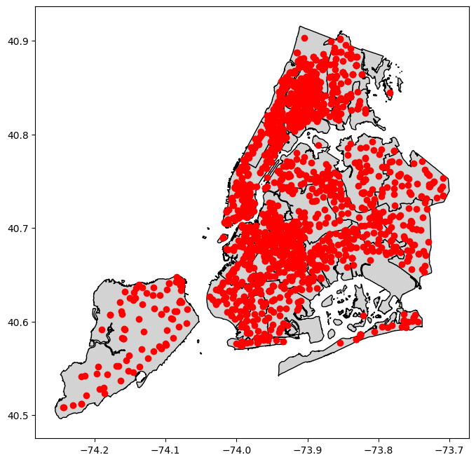
Plotting twice: schools inside of districts#
districts contains the shape files for the 32 geographic districts in the NYC Schools.
In the cell below, we create a new figure and axis and then plot both the districts and the schools using ax – the same axis. This makes a graph where schools are plotted on top of the districts.
# create the plot
fig, ax = plt.subplots(figsize=(8, 8))
# first, plot the districts onto `ax`
districts.plot(ax=ax, color="lightgray", edgecolor="black", linewidth=1)
# second, plot the schools onto `ax`
_ = df.plot(ax=ax,color="red")
Folium map with styles#
We’ve seen how the explore() function generates an interactive, geographic Folium map. In this example we create an interactive district map where we specify more of the styles for the map to give it a unique look. We save the map into the district_map variable because we’re going to re-use it later.
district_map = districts.explore(
column="district", # use district for the category colors (aka choropleth)
popup=False, # turn things off
tooltip=False,
legend=False,
tiles="CartoDB positron", # use "CartoDB positron" tiles
cmap="tab20b", # use "tab20b" matplotlib colormap
style_kwds={"color":"black"} # use black outline
)
# add a label to each district with the district number
ui.label_shapes(district_map, districts, "district", style={"color":"black", "font-size":"16px"})
district_map
Layering Folium maps#
In the first example, we plotted schools on top of a district plot using matplotlib. We can use the same approach to make more complex, interactive Folium maps with the explore() function in our GeoDataFrame. In this example we merge the school geo dataframe with our demographic data, then get a reduced set of shared columns to plot in the map. When we call explore() we pass the district_map in as the m argument, making that the base map for our plot. Our chloropleth just uses categorical colors (i.e. the colors just help us distinguish boundaries). Each school is marked as a circle on the map, and the colors indicate which type of school it is:
0. district school (for districts 1-32)
charter school
dist 75 (SWD)
other school types
Custom pop-ups#
This example demonstrates how to use data from our dataframe to create custom interactions with our map using mouse-over and pop-up events. Using the ui.popup() function from nycschools we can choose which columns to include in the pop up, with default styles and formatting applied to make the data easier to read.
Hex colors#
Our maps want to use hex colors, so the use the hexmap() translation function from nycschools.ui that takes a standard matplot lib color map and wraps it so that it returns hex colors. Our custom map takes the 35 different districts and
# get the columns we need for our pop-up
cols = ["dbn", "school_name", "total_enrollment", "poverty_pct", "asian_pct", "black_pct", "hispanic_pct", "white_pct"]
school_geo = df.merge(demo[cols], on="dbn")
school_geo = school_geo[cols + ["district", "geometry", "x", "y"]]
cmap = ui.hexmap(plt.get_cmap("tab10"))
def school_type(x):
if x < 33:
return cmap(0)
if x == 84:
return cmap(1)
if x == 75:
return cmap(2)
return cmap(3)
school_geo["school_color"] = school_geo.district.apply(school_type)
school_geo["school info"] = school_geo.apply(ui.popup(cols), axis=1)
school_map = school_geo.explore(m=district_map,
tooltip=False,
popup="school info",
color="school_color",
# set the marker size
marker_kwds={"radius": 2.5},
style_kwds={"stroke":False})
school_map