Bar Charts
Contents
Bar Charts#
This notebook introduces the methods of creating bar charts from our data, including some of the key concepts of our plotting package, matplotlib. Bar charts are useful for making comparisons between close data because we are very good at evaluating the size of rectangles.
Topics covered:
bar charts
styling charts (titles, labels, size, color, etc)
import matplotlib as plt
from nycschools import schools

df = schools.load_school_demographics()
Simple Bar Chart#
We can quickly and easily create charts in pandas by calling
the bar.plot() function on a DataFrame. The first step is to
create a table where the data is ready to present.
In this example, we’ll create a bar chart from the school
enrollment data in df (the school demographics).
We’ll get started by borrowing the code from our groupby and agg
examples.
# get a few columns for just the 2020-21 school year
boros = df[["boro", "dbn", "total_enrollment", "ay"]]
boros = boros[boros.ay == 2020]

# group the data by borough
table = boros.groupby(by="boro").agg({
    "dbn":"count",
    "total_enrollment":["sum", "mean", "min", "max"]}).reset_index()

# rename the columns with "pretty" names
cols = ["Borough", "Num. Schools", "Total Students", "Avg School Size", "Smallest School", "Largest School"]
table.columns = cols
table
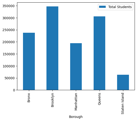
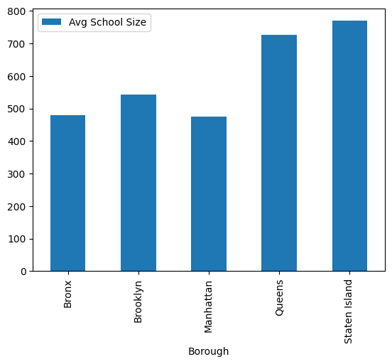
| Borough | Num. Schools | Total Students | Avg School Size | Smallest School | Largest School | |
|---|---|---|---|---|---|---|
| 0 | Bronx | 496 | 238074 | 479.987903 | 7 | 2936 |
| 1 | Brooklyn | 640 | 346802 | 541.878125 | 46 | 5921 |
| 2 | Manhattan | 408 | 194144 | 475.843137 | 14 | 3342 |
| 3 | Queens | 421 | 305660 | 726.033254 | 42 | 4424 |
| 4 | Staten Island | 83 | 63824 | 768.963855 | 144 | 3726 |
Drawing the plot#
Making a chart from our table is as simple as calling plot.bar(). In the example below we specify that we want enrollment (school size) as the vertical y-axis and Borough as our x-axis.
ax = table.plot.bar(x="Borough", y=["Total Students"])
# doe the same thing with average school size
ax = table.plot.bar(x="Borough", y=["Avg School Size"])
Labels, figure size, and more#
We can make a pretty decent bar chart for a single line of code, but with a few more arguments to our function, we can make it even better. To do this, we’re going to use a few more features from matplotlib and related libraries.
In this example we will specify:
sorting the columns by size
setting the images size
adding titles and labels
changing colors
You may have noticed that we were assigning the return value from plot() into a new variable called ax. This servers the simple purpose of showing only the chart (and not the return value), but it also allows us to keep adding items to our chart.
# before drawing anything, change the "style"
plt.style.use('dark_background')

# show all the styles
# change dark_background to any style from this list to try it out
plt.style.available
['Solarize_Light2',
 '_classic_test_patch',
 '_mpl-gallery',
 '_mpl-gallery-nogrid',
 'bmh',
 'classic',
 'dark_background',
 'fast',
 'fivethirtyeight',
 'ggplot',
 'grayscale',
 'seaborn-v0_8',
 'seaborn-v0_8-bright',
 'seaborn-v0_8-colorblind',
 'seaborn-v0_8-dark',
 'seaborn-v0_8-dark-palette',
 'seaborn-v0_8-darkgrid',
 'seaborn-v0_8-deep',
 'seaborn-v0_8-muted',
 'seaborn-v0_8-notebook',
 'seaborn-v0_8-paper',
 'seaborn-v0_8-pastel',
 'seaborn-v0_8-poster',
 'seaborn-v0_8-talk',
 'seaborn-v0_8-ticks',
 'seaborn-v0_8-white',
 'seaborn-v0_8-whitegrid',
 'tableau-colorblind10']
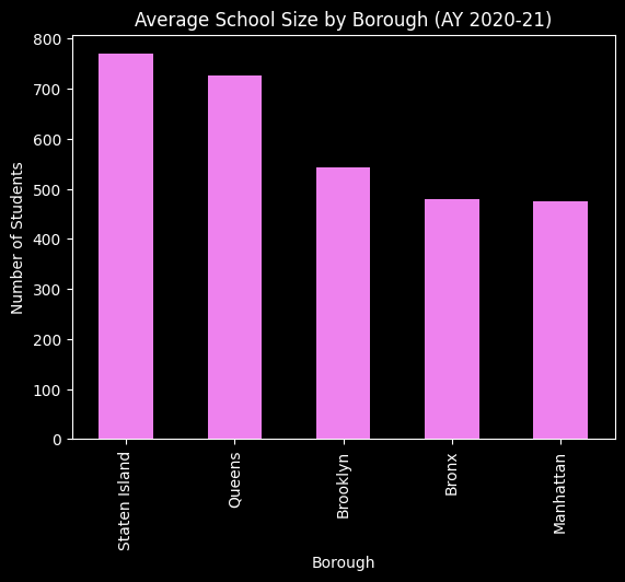
# sort the tabgle in descending order by school size -- this will order our bars
table = table.sort_values(by="Avg School Size", ascending=False)

ax = table.plot.bar(x="Borough", y=["Avg School Size"], color="violet")
ax.set_title("Average School Size by Borough (AY 2020-21)")
ax.set_ylabel("Number of Students")
ax.get_legend().remove()