Introduction to Maps and Spatial Data
Contents
Introduction to Maps and Spatial Data#
These examples use the GeoPandas package which adds special
functions for DataFrames to work with geographic data.
There are two basic ways to visualize the data spatial data (aka make maps):
plot() and explore(). plot() creates a matplotlib chart of the data, explore() creates an interactive map with the shapes overlayed on open map data.
For the visualizations to work, though, you have to set a relevant index on the data. In our case here, the index is the district number.
After the basic plots, we merge the school district data with the school demographics data in order to create more detailed examples.
Useful links:
# uncomment and run if using Google Colab
# !pip install geopandas
# !pip install nycschools
# from nycschools import dataloader
# dataloader.download_data()
import pandas as pd
import geopandas as gpd
import numpy as np
import matplotlib.pyplot as plt
import seaborn as sns
from IPython.display import Markdown as md
from nycschools import schools, geo, ui
GeoDataFrame#
GeoDataFrame adds geospatial data to a regular pandas DataFrame. The specially named geometry column is used to plot the spatial data on a map.
# read the GeoJSON file directly from the download link
gdf = geo.load_districts()
# each shape in "geometry" represents a district
gdf = gdf.set_index("district")
gdf.head()
| area | length | geometry | |
|---|---|---|---|
| district | |||
| 32 | 51898496.7618 | 37251.0574964 | MULTIPOLYGON (((-73.91181 40.70343, -73.91290 ... |
| 16 | 46763620.3794 | 35848.9043428 | MULTIPOLYGON (((-73.93312 40.69579, -73.93237 ... |
| 17 | 128440514.645 | 68356.1032412 | MULTIPOLYGON (((-73.92044 40.66563, -73.92061 ... |
| 13 | 104871082.804 | 86649.0984086 | MULTIPOLYGON (((-73.97906 40.70595, -73.97924 ... |
| 25 | 443759165.29 | 176211.272136 | MULTIPOLYGON (((-73.82050 40.80101, -73.82040 ... |
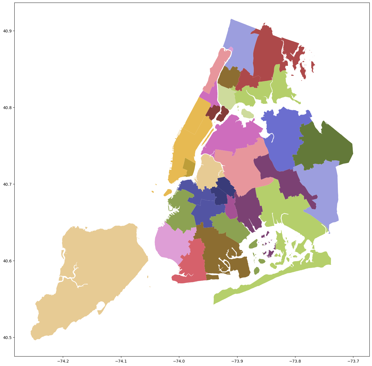
# draw the basic map using the tab20b color map
_ = gdf.plot(figsize=(16, 16), cmap="tab20b")
# explore gives us an interactive map
# non-geo columns show up when you hover over a shape
gdf.explore()
Merging School Data with Geo Data#
# load the demographics
# group the data at the district level
# merge the two dataframes on the district
dist_map = gdf.copy()
demo = schools.load_school_demographics()
demo = demo.query(f"ay == {demo.ay.max()}")
aggs = {
'total_enrollment': 'sum',
'asian_pct': 'mean',
'black_pct': 'mean',
'hispanic_pct': 'mean',
'white_pct': 'mean',
'swd_pct': 'mean',
'ell_pct': 'mean',
'poverty_pct': 'mean'
}
demo = demo.groupby("district").agg(aggs)
cols = [c for c in demo.columns if c.endswith("pct")]
for col in cols:
demo[col]= demo[col].apply(lambda x: f"{round(x*100, 2)}")
dist_map = dist_map.reset_index()
dist_map.district = pd.to_numeric(dist_map.district, downcast='integer', errors='coerce')
dist_map = dist_map.join(demo, on="district", how="inner")
dist_map = dist_map.set_index("district")
dist_map = dist_map[['geometry', 'total_enrollment', 'asian_pct',
'black_pct', 'hispanic_pct', 'white_pct', 'swd_pct', 'ell_pct',
'poverty_pct']]
dist_map.head()
| geometry | total_enrollment | asian_pct | black_pct | hispanic_pct | white_pct | swd_pct | ell_pct | poverty_pct | |
|---|---|---|---|---|---|---|---|---|---|
| district | |||||||||
| 32 | MULTIPOLYGON (((-73.91181 40.70343, -73.91290 ... | 9831 | 1.97 | 15.87 | 78.73 | 2.61 | 21.46 | 24.09 | 87.66 |
| 16 | MULTIPOLYGON (((-73.93312 40.69579, -73.93237 ... | 7127 | 2.4 | 68.88 | 21.85 | 4.72 | 27.09 | 5.87 | 86.54 |
| 17 | MULTIPOLYGON (((-73.92044 40.66563, -73.92061 ... | 20628 | 3.23 | 72.76 | 17.7 | 3.67 | 21.67 | 10.56 | 83.58 |
| 13 | MULTIPOLYGON (((-73.97906 40.70595, -73.97924 ... | 24564 | 6.45 | 54.65 | 22.49 | 12.66 | 20.81 | 6.3 | 69.2 |
| 25 | MULTIPOLYGON (((-73.82050 40.80101, -73.82040 ... | 38992 | 49.74 | 6.43 | 30.36 | 11.21 | 15.4 | 20.81 | 68.98 |
Use a column to color a choropleth#
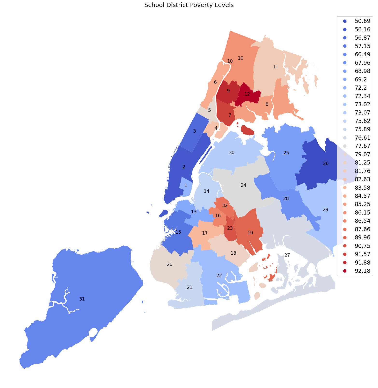
Choropleths use colored region to help visualize spatial data. The map below uses the average percent poverty in each of the 32 community school districts to help visual relative wealth of the different districts in NYC Schools. The area of each district is colored using a divergent cool-warm color map. Darkest blue districts have the lowest average poverty rate and darkest red have the highest rate.
Choropleth of school poverty#
# make a plot that uses the poverty percent as a the value for the color map
# this is the `column` keyword argument for plot()
fig, ax = plt.subplots(figsize=(16, 16))
sns.set_context('talk')
# don't show the boundary box or x/y ticks
plt.axis('off')
fig.tight_layout()
ax.set_title('School District Poverty Levels', pad=20)
# put the district number in the center of each district
def label(row):
xy=row.geometry.centroid.coords[0]
ax.annotate(row.name, xy=xy, ha='center', fontsize=14)
dist_map.apply(label, axis=1)
_ = dist_map.plot(legend="True", ax=ax, column="poverty_pct", cmap="coolwarm")
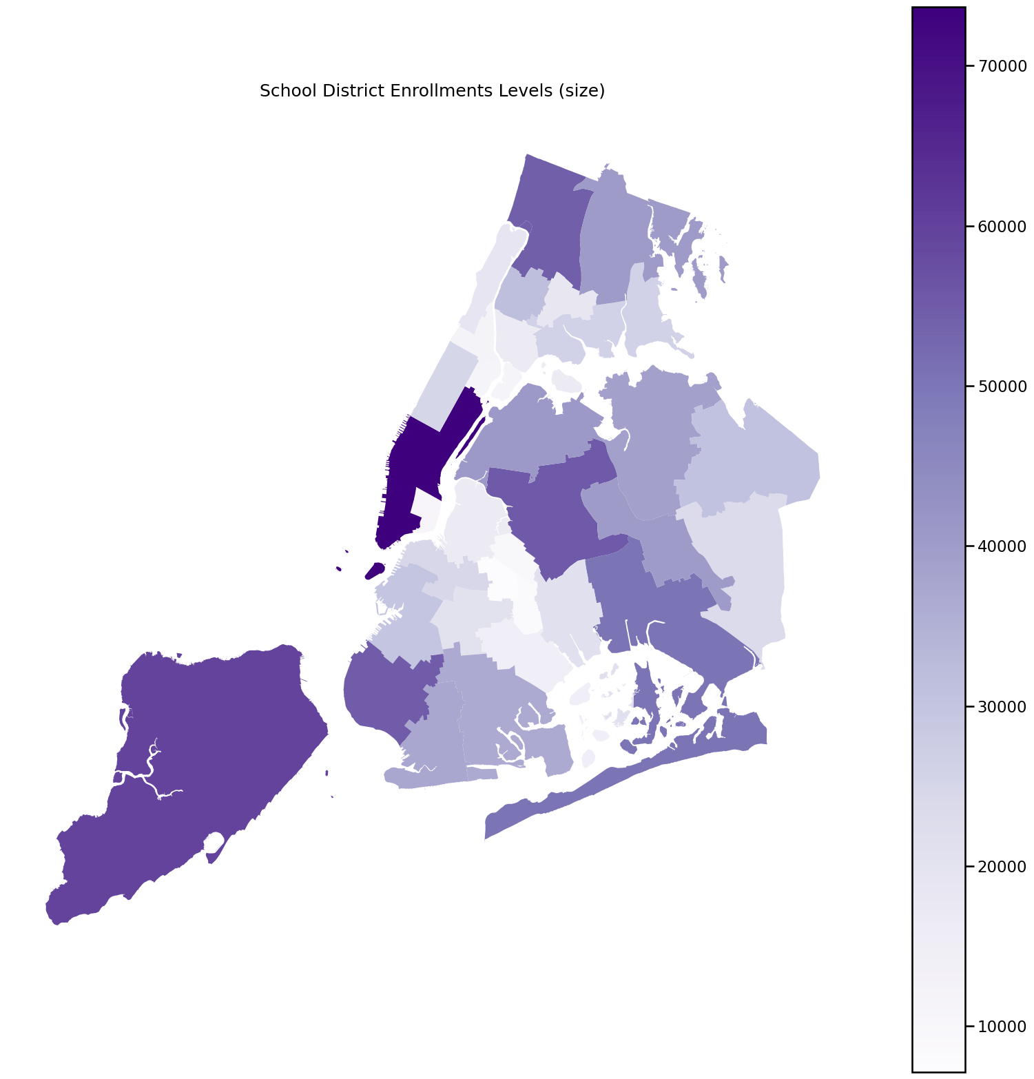
Choropleth of school district enrollment#
# if we pass a different column, we can create a different plot
fig, ax = plt.subplots(figsize=(16, 16))
sns.set_context('talk')
plt.axis('off')
fig.tight_layout()
ax.set_title('School District Enrollments Levels (size)', pad=20)
dist_map.plot(legend="True", ax=ax, column="total_enrollment", cmap="Purples")
plt.show()
Chlorpleths in Folium#
The geopandas explore() methos also has a column keyword that lets us draw a Folium map.
Below we show the districts by poverty level. Mouse over and you can see all of the demographic data for the district as a pop-up.
dist_map.explore(column="poverty_pct", cmap="coolwarm")